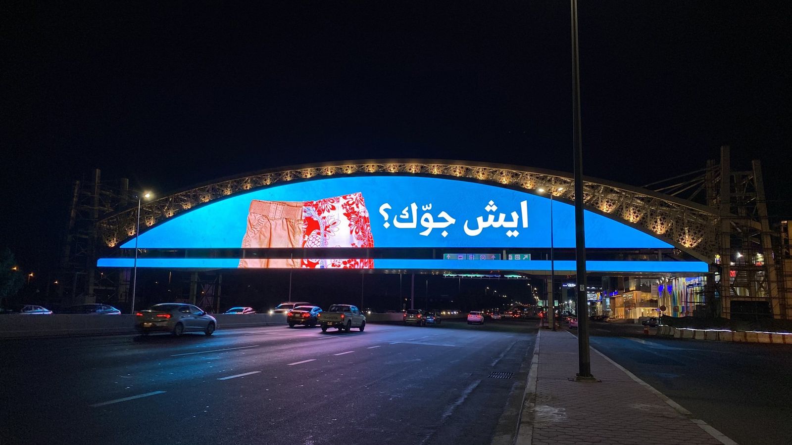
A roadside screen is not a big phone. People see it while driving, for a few seconds, in a loop shared with other advertisers. Most of the mistakes I see come from designing on a laptop at arm's length and forgetting where the work will actually live.
During my years at Saudi Signs & Wave Media (2015–2022), I watched outdoor advertising move from printed billboards to digital screens. These are the rules I still work by.
Respect the glance budget
Highway design guidance is blunt about it. Oregon's Department of Transportation puts the average viewable time at "around 7 seconds" and advises keeping billboard copy to "9 words or fewer." Treat both as ceilings, not targets.
- One message. If you need a second idea, you need a second ad.
- One hero image. A product, a face of the offer, or a single striking scene.
- One brand cue, large enough to register even if nothing else does.
Design for distance, not for your monitor
- The 5% test: zoom out until your layout is the size of a thumbnail. If you can't read the headline, a driver can't either.
- Heavy weights win. Thin strokes and hairline serifs vanish at distance. Bold sans-serifs and sturdy Arabic Naskh or Kufi styles hold up.
- Decorative Arabic scripts like Diwani or Thuluth are beautiful, but use them as texture or a short word, never for the message itself.
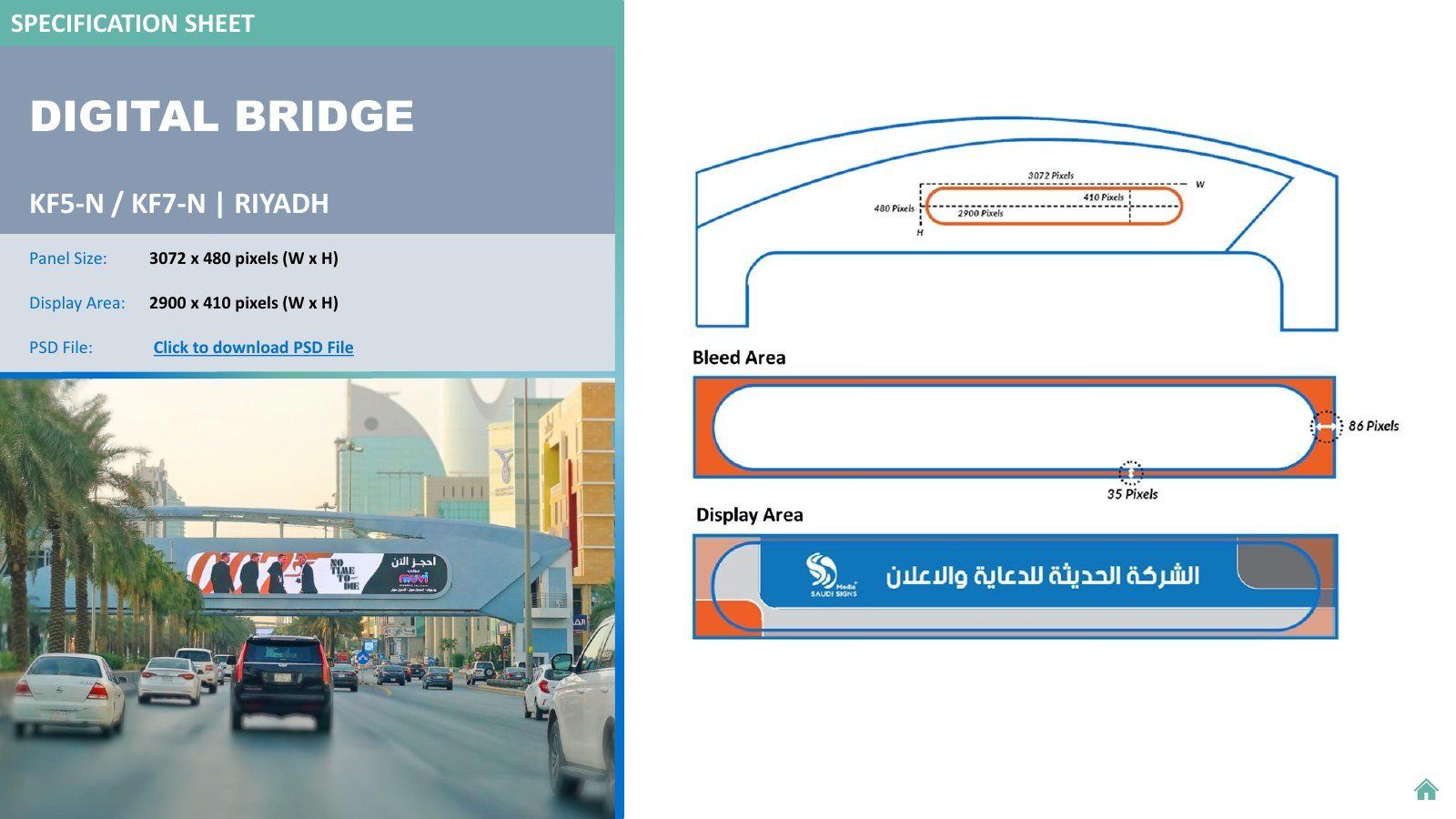
- Mind the pixel pitch. On LED screens each pixel is physically large. Small text, fine lines and subtle gradients break apart. Always design at the screen's native resolution from the operator's spec sheet, then preview it scaled down.
Contrast for day and night
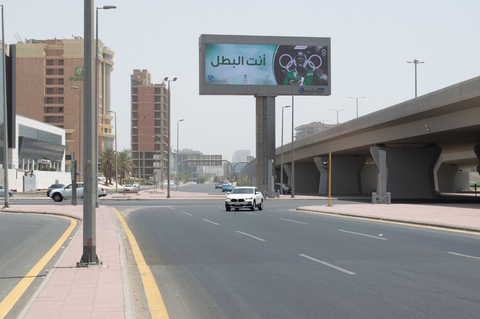
- Keep strong light-and-dark contrast between text and background. Busy photos behind text kill readability.
- A screen that looks balanced at noon can glare at night. Avoid large areas of pure white, and check whether the operator adjusts brightness after dark.
- Colours that sit close in brightness (orange on red, blue on purple) blur together at speed, even if the hues differ.
Use motion with restraint
Rules for motion vary by location and authority, so start with the operator's specifications. Where motion is allowed:
- Keep the brand and the key line on screen the whole time. A driver may catch any single second of your slot.
- Make the first frame and the last frame each work on their own.
- Avoid fast flashing and rapid cuts. They distract drivers, and distracting drivers is never good for a brand.
Build a system for chaotic formats
Bridges are extremely wide and short. Unipoles are closer to standard landscape. Mall screens are often portrait. One layout will not survive all of them.
- Define zones: brand, message and image, each with rules for how it stretches or stacks.
- Keep a sizes sheet per campaign: location, resolution, file type, duration and deadline.
- Name files by location and size. On delivery day, clear naming prevents the wrong file going to the wrong screen.
Avoid what drivers can't use
- Long phone numbers, full URLs and QR codes on roadside screens rarely work at driving speed. Use a short, memorable brand name or handle instead.
- Fine print and legal text belong on the landing page, not the bridge.
Pre-flight checklist
- ✔ Nine words or fewer
- ✔ Readable at thumbnail size
- ✔ Brand visible from the first second
- ✔ Strong contrast, tested on dark and bright backgrounds
- ✔ Built at the native resolution of each screen
- ✔ Arabic letters correctly joined after export
- ✔ Files named by location, with durations matching the slot